Split Complementary Color Scheme

You can see that no matter where you start, there will always be at least one Tertiary color in your selection. Tertiary colors are blends and will make your resulting palette quite sophisticated with an infinite number of subtle mixtures.
This color scheme is extremely popular with artists and designers.
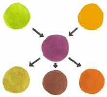
Example of a Split Complementary Color Scheme

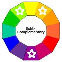
On either side of the Yellow directly opposite Violet in theColor Wheel is Yellow/Green and Yellow/Orange. They are shown on the top row. The cleanest, loveliest paint mixtures will be achieved if you mix your own Yellow/Green and Yellow/Orange using the same Yellow for both.
By adding a tiny bit of Violet to the two top paint colors you get some interesting results.
Violet + Yellow/Green = Olive
Violet + Yellow/Orange = Burnt Orange
Violet + Yellow/Green + Yellow/Orange = Neutral Brown
Notice how the 3 mixtures on the bottom row work so well together. There’s never any clashing with this method.
Of course you can then alter each of these even further by adding White, Black or Grey. Add more of the three hues too if you begin to lose the color. As long as you stick with the same three and don’t add any other Hue, they will always go together.
Think About This …..
There are twelve different Split Complementary Color Schemes, one for each of the twelve depending on which is the Mother Color.
So in our example above, using Yellow-Green as your ‘Mother Color’, your palette would beViolet and Red instead. It’s a completely different paint selection with completely different mixtures.
Split Complementary Painting Tips
- Make one of your three colors dominant in your palette.
- Use various intensities of that dominant color, by adding different proportions of its Split Complementaries. Then vary the values by adding white to lighten or black to darken and grey to tone down.
- Always mix pigment a tiny bit at a time. Some can overpower very quickly.
- For contrasting accents, choose one or both of the non-dominant color. Make sure it has a tiny bit of the dominant Mother Color mixed in to soften it a touch. Otherwise these accents will jump out to the eye a bit too much.
- Experiment with various balance of mixtures on a piece of paper or in your sketchbooks before you start working on a project. It will give you a better feel of the full range of colors you can achieve.
Check out these Color Schemes
Triad
Complementary Triad
Modified Triad
Rectangular Tetrad
Square Tetrad
Adjacent Tetrad
Analogous
Analogous Complementary
Multi-Color

