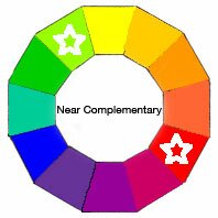
Near Complementary Color Scheme

A Near Complementary Color Scheme is a simple, yet interesting, two-color palette. It’s a Complementary Color Scheme with a twist ….
… a clockwise or counterclockwise twist !
Instead of going straight across the Basic Color Wheel, this time you choose the color immediately to the right or left of it. This palette is sometimes also referred to as a Counterpoint ColorScheme.
Here’s an example

I’ve gone across from RED clockwise one space to YELLOW / GREEN. Notice how the mixture gets less intense the more the two colors intermingle. Yet they still remain vibrant, unlike true Complementary Colors.
You’re free to go in either clockwise or counterclockwise from the position directly across from your starting color, also known as the ‘Mother Color’.
In this example, selecting counterclockwise from RED one space gives you BLUE / GREEN.
Or starting from the opposite side, starting with your Mother Color YELLOW / GREEN, yourNear Complementary going clockwise on the Color Wheel chart is VIOLET
- There are 12 difference combinations on the Color Wheel –
- 6 clockwise and 6 counterclockwise.
The most versatile color scheme using two colors.
A Near Complementary Color Scheme is the most versatile choice when you’re confined to using only two paint colors. As long as one is dominant the hues are far enough apart on the Basic Color Wheel that they enhance each other when sitting side by side. With the more intense, least mixed together near complementaries, you achieve a brightening effect called Simultaneous Contrast.
These pairs also have the ability to create lovely toned-down mixtures without rapidly getting dull like Complementary Colors are apt to do. When you mix two Near Complements together the result becomes increasingly neutral. But unlike true Complementary Colors much of the vibrancy of the original color still remains. One doesn’t overpower the other so quickly.
That’s because to totally neutralize the hues to gray, you require an equal portion of the thirdPrimary Color which in this example would be Blue. Yes, you need Blue to create Green, but this Yellow / Green is dominant Yellow. It’s that teeny tiny amount of Blue within the Yellow / Green that tones everything down but there’s so little of it that the result is still lively.
Notice how this range of Hues go so beautifully together. Remember that you can extend your range of colors even further by adding various amounts of White, Black or Gray to create Tints, Shades or Tones.
Hot Tips !! Painting with Near Complementary Colors
1. Make one of your colors dominant in your palette.
2. Use various intensities of that dominant color, by adding different proportions of its Near Complement. Then vary the values by adding white to lighten or black to darken and grey to tone down.
3. For contrasting accents, choose the non-dominant color. Make sure it has a tiny bit of the dominant Mother Color mixed in to soften it a touch. Otherwise these accents will jump out to the eye a bit too much.
4. Experiment with various balance of mixtures on a piece of paper before you start working on a project. It will give you a better feel of the full range of colors you can achieve.
Check out these Color Schemes too !
Triad
Complementary Triad
Modified Triad
Rectangular Tetrad
Square Tetrad
Adjacent Tetrad
Analogous
Analogous Complementary
Multi-Color

