

What’s the Difference between a Hue, Tint, Shade and Tone ?
Ask Yourself first…
What’s the difference between a Hue and a Color? Most people, even the pros, get confused about this. Basically they mean the same thing and can be used interchangeably.
The words are a general terms to describe the color family on the Basic Color Wheel that your swatch is rooted in. They indicate the root of the variations we see. To make things simpler, think of a Hue as one of the twelve colors on the mixing wheel.
Most Color Wheels only show bright colors which can create confusion. It’s not always easy to see that every color, even black, has a Primary, Secondary or Tertiary Color as its root.
Burgundy = the root Color or Hue is RED
Navy = the root Color or Hue is BLUE
Rust = the root Color or Hue is ORANGE
Hues
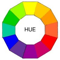
These are the family of twelve purest and brightest colors.
- Three Primary Colors
- Three Secondary Colors
- Six Tertiary Colors
They form the full spectrum of colors which progress around the Primary Color Wheel in gradual increments.
With just these twelve colors, you can literally mix an infinite number of color schemes. Most of the time you will modify these twelve basic hues by mixing in other colors.
But nothing is stopping you from using them full-strength. This multi-color scheme would be bold, cheerful and exciting. It would be great in a child’s playroom. Bright, bold selections can also work to grab attention in advertising and marketing graphics. Creating a painting with these would be a little jarring.
Tints
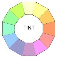
Every individual color on the Basic Color Wheel can be altered in three ways by Tinting, Shading or Toning. And that’s before we even think about mixing two colors together.
Let’s start with Lightening the twelve basic colors to create Tints.
A Tint is sometimes called a Pastel. Basically it’s simply any color with white added.
If you want to get a little more complicated, you can mix any of the twelve pure colors together. Then simply add any amount of white and you have created a pastel or tint of the mixture.
That means you can go from an extremely pale, nearly white to a barely tinted pure hue. Artists often add a tiny touch of white to a pure pigment to give the color some body. So for example a bright Red can quickly become a bright Pink.
A color scheme using Tints is usually soft, youthful and soothing, especially the lighter versions. All tints work well in in feminine environments. You often see advertising, marketing and websites use pale and hot pastels if they are targeting women as a demographic. In painting you might save your lightest pastels for the focal point or use pastels for the entire painting.
Shades
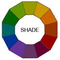
So now that you know how to lighten, what’s the easiest way to make your colors darker?
A Shade is simply any color with black added.
Just as with making tints, you can mix any of the twelve pure colors together. Then simply add any amount of black and you have created a shade of the mixture.
That means you can go from an extremely dark, nearly black to a barely shaded pure hue.
Most artists use black sparingly because it can quickly destroy your main color. Some artists prefer not to use it at all. Instead they understand the rules of color well enough to make their own black mixtures.
Shades are deep, powerful and mysterious. Be careful not to use too much black as it can get a little overpowering. These darks work well in a masculine environment. They are best used as dark accents in art and marketing graphics.
Tones
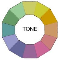
Now that you understand how to lighten and darken your twelve colors how do you tone them down?
Almost every color we see in our day-to-day world has beentoned either a little or a lot. This makes for more appealing color combinations.
A Tone is created by adding both White and Black which is grey. Any color that is “greyed down” is considered a Tone.
Tones are somehow more pleasing to the eye. They are more complex, subtle and sophisticated.
Artists usually mix a little grey in every paint mixture to adjust the value and intensity of their pigment. Tones are the best choice for most interior decorating because they’re more interesting. They work well in any Color Scheme you might plan
Try this for fun !!
The experience of actually mixing these yourself will help you understand subtleties of color much more profoundly.
Download the first and third Free Printable Color Wheels to practice on.
1. Print out several of the third free template on standard white 8 1/2″ x 11″ paper.
2. Get out a set of 12 basic paint colors plus white and black. Or mix your Secondary and Tertiary colors yourself from scratch. Keep it simple like watercolor, poster paints or acrylic.
3. Mix your Tints, Shades and Tones and fill in the areas on the wheel. Don’t worry about being perfect.
4. Be sure to keep them for reference. Yes, even the ones you think are mistakes.