Neutrals are changing. While white, beige, and soft grays have long been the go-to shades for calm, minimalist spaces, designers are shifting toward richer tones that still play well with everything. One color that keeps showing up in their palettes? Anthracite color.
It's dark, but not black. Warm, but not brown. The kind of color that brings structure to a space without dominating it. On the Color Wheel, anthracite doesn't scream for attention, but it anchors a room beautifully. It sits right where mood and function meet, making it ideal for modern interiors.
That's why more designers are calling anthracite the new neutral. It works quietly in the background or stands strong as a feature. Let's break down why.
What Is Anthracite Color?
Anthracite is a deep, smoky gray with charcoal undertones. It gets its name from anthracite coal, a natural fuel that's nearly jet black but has a reflective, metallic sheen. That hint of warmth and richness is what sets anthracite apart from plain gray.
The finish makes a difference, too. In matte, it feels soft and velvety. In gloss or metal, it takes on an urban, polished look. Because of this range, anthracite is incredibly flexible. It can feel industrial or cozy, modern or classic, depending on how you use it.
Why Designers Are Replacing Traditional Neutrals
Neutral doesn't mean boring anymore. Designers are turning to richer shades that still serve as a base for layering color and texture. Anthracite fits that need.
More Depth Than Beige or White
Color anthracite offers visual weight. It grounds a room in a way that lighter neutrals can't. That's useful in open spaces or large rooms where something needs to break the visual monotony.
It also adds contrast without going full black. You get the drama without the heaviness. A white room with anthracite trim or shelving instantly feels sharper and more intentional.
A Modern Look That Feels Timeless
Unlike trend-driven colors that fade out in a season or two, anthracite sticks. It's contemporary, but it doesn't age quickly. It adapts well across styles: minimalist lofts, or Japandi-inspired interiors, and classic townhouses.
That's a big reason it's gaining ground in cabinetry, doors, and even exteriors. It doesn't compete with other colors. It complements them, quietly doing the heavy lifting.
Perfect Pairings: What Goes With Anthracite
Pairing anthracite with other shades takes a little balance. It plays well with both warm and cool tones, which is part of its charm.
Earthy neutrals like clay, beige, or walnut soften the seriousness of anthracite. Light tones like ivory or pale sage lift it visually. Metallics like brass or aged gold give it a luxe touch without going over the top. Free printable color wheels are great for experimenting with combinations.
If you want to push into color, anthracite won't clash. Muted tones like dusty rose, mustard, or denim blue sit comfortably next to it, adding personality while keeping the palette grounded.
How Anthracite Color Works in Interior Design
What color is anthracite, and what is it good for? Almost everything. The way it plays with light and texture gives it a surprising range, especially in home interiors.
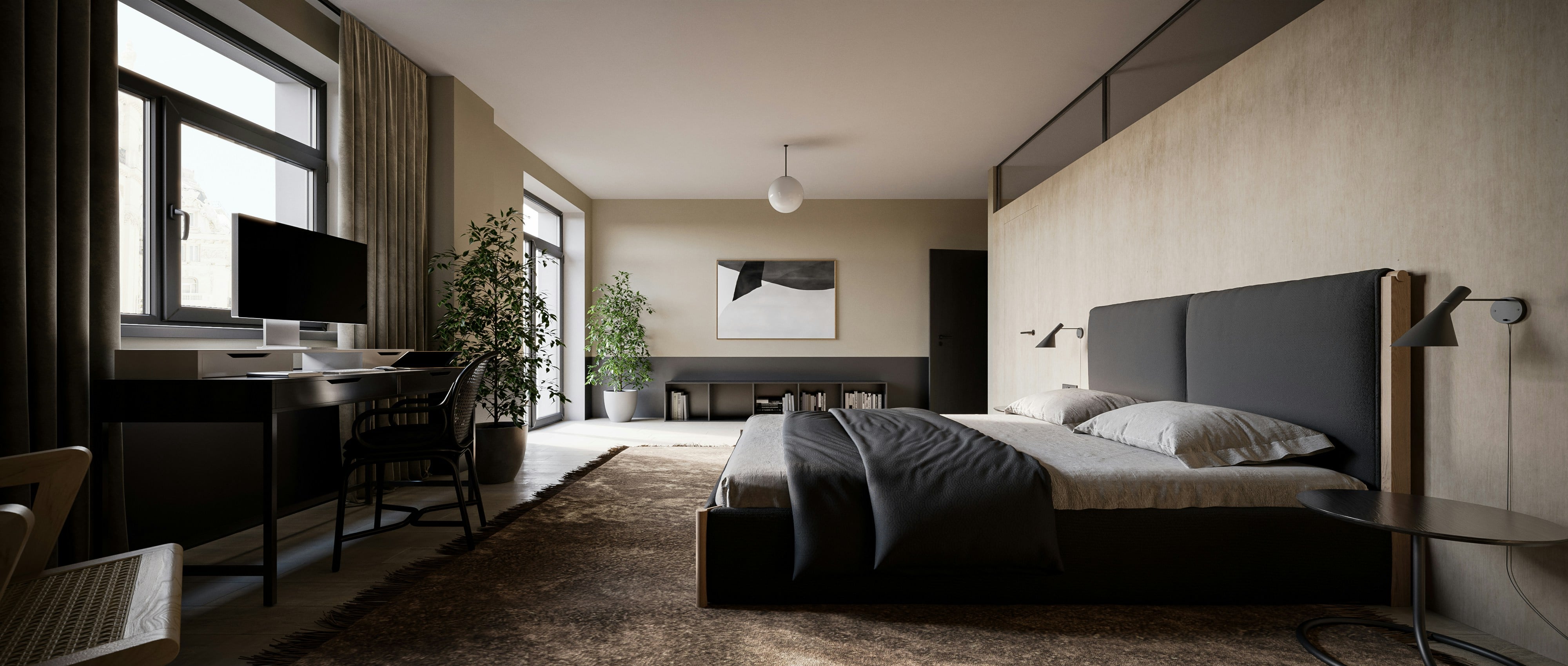
Furniture and Fixtures
Walls and Cabinets
Accents and Accessories
Final Thoughts: Anthracite as a Statement Neutral
Designers aren't calling anthracite the new neutral just to sound edgy. It's practical, flexible, and refreshingly understated. It fits in while still feeling elevated.
If you're bored of white walls or beige furniture, but not ready for bold reds or jewel tones, anthracite is the quiet revolution your space might need.