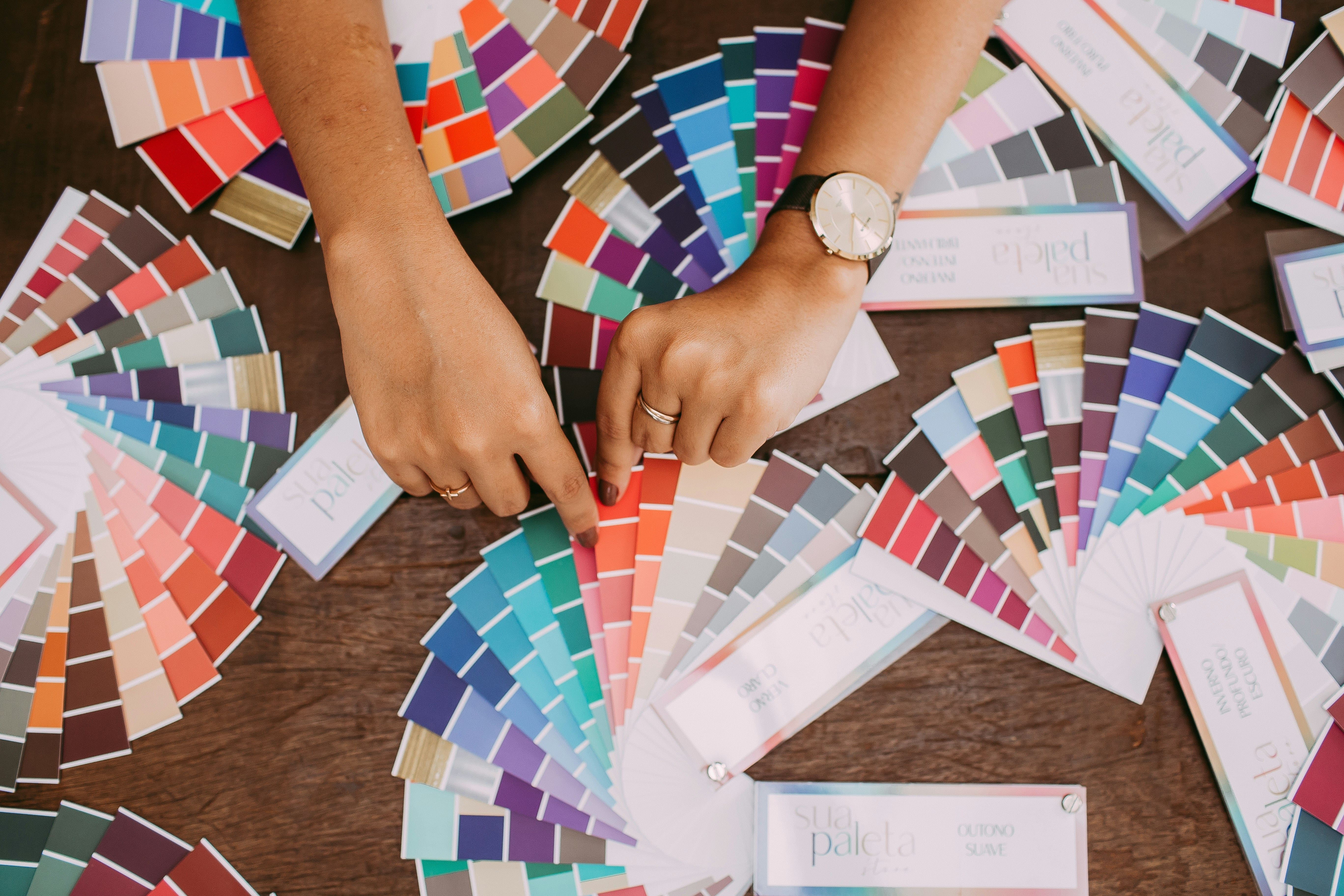
What Is the Prettiest Color?
1. Blush Pink: Soft but Strong
Blush pink has been everywhere, from fashion runways to minimalist websites. It adds warmth and personality without screaming for attention.
Blush pairs well with neutrals like beige and gray but also surprises when combined with navy or forest green. It’s been called the prettiest color ever by those who love romantic, calming palettes.
2. Teal: Bold Without Being Loud
Teal mixes the calmness of blue with the energy of green, giving you a balance that feels fresh but grounded. It works beautifully in modern, boho, or even corporate designs.
Some creatives consider teal the world’s prettiest color because of its adaptability. Whether used as an accent or a background, it has enough personality to stand on its own but plays well with others, too.
3. Lavender: Calm Meets Creative
Lavender offers a dreamy, creative tone that’s perfect for portfolios, invitations, or beauty brands. It has a softness that soothes and a uniqueness that sticks in your mind. You won’t see it in every design, which is exactly why it works. Home remodeling contractors often use this color as an accent when renovating homes, such as a kitchen backsplash or an accent wall in a living room.
If you’re tired of basic pastels, lavender brings something a little extra. It stands out as the prettiest color in the world for people who want elegance with a hint of playfulness.
4. Coral: Bright and Approachable
Coral blends the energy of orange with the friendliness of pink. It is playful and fun, and it works across platforms: print, digital, fashion, you name it.
It’s often named one of the prettiest colors in the world because it catches your eye without overwhelming the design. Add it to headers, call-to-actions, or key visuals when you want a splash of positivity.
5. Dusty Blue: Cool and Collected
Dusty blue is a cooler-toned sibling of classic blue. It carries sophistication and calm, making it perfect for formal branding, tech, or weddings. It’s often chosen when designers want to use blue without being too obvious.
It works especially well with muted tones like taupe, ivory, and rose gold. Many call it the most stunning color for refined visuals that still feel warm and human.
6. Terracotta: Rich and Rooted
Terracotta brings warmth and character. With its earthy red-orange tones, it feels handmade, grounded, and full of personality. It’s great for lifestyle brands, artisan shops, and editorial design.
Pair it with cream, mustard, or navy for that rich, modern vibe. Designers who use free printable color wheels see terracotta as a powerful choice on the warm spectrum. It adds depth without overpowering the page.
7. Olive Green: Understated and Elegant
Olive might not be the first shade you think of, but in the design world, it’s a hidden gem. It brings depth and richness without being too bold. Earthy and neutral, it works across styles—from rustic to minimalist to modern editorial.
Olive green often complements natural textures and soft creams. Designers who appreciate subtle color palettes often call it the prettiest color for grounding bolder accents.
8. Mint Green: Fresh and Friendly
Mint is light, crisp, and energetic. It instantly adds a clean, welcoming feel. It works well for wellness brands, skincare packaging, or fresh-looking web designs.
Mint is also incredibly photogenic, which is why it shows up a lot in lifestyle blogs and product shots. It’s frequently called one of the prettiest colors for spring-themed design work or anything needing a pop of freshness.
Conclusion
So, what’s the verdict? The most pretty colors for design aren’t just the popular ones. They’re the ones that bring clarity, balance, and emotion to your work. From calming blues to rich terracottas, each color offers something different.
