Leave a Comment:
Academic writing support provides like essay writer service EssayWritingService personalized essays, tailored to course requirements and written with precision and academic integrity.


Primary colors are everywhere when we take the time to notice. So are Secondary and Tertiary colors. As a creative person, you are likely inspired by the colors you see in the world. Without a doubt you might be moved to capture the brilliance in a painting.
More...
But as mentioned in another post, artists work with pigments which are Subtractive Color. As a result we often end up with muddy colors that don't look anything like we envisioned.
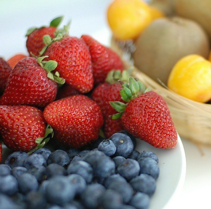
For instance you may want to paint the delicious-looking strawberries above. However, it's not enough to just use red paint. You know this of course. However, the trouble begins when you mix in other pigments. Instead of luscious reds, you may get frustrated because the results are sometimes drab, dirty colors instead.
Obviously, you want to mix yummy-looking colors that almost look good enough to eat. Therefore, you must understand the root of every paint pigment you use.

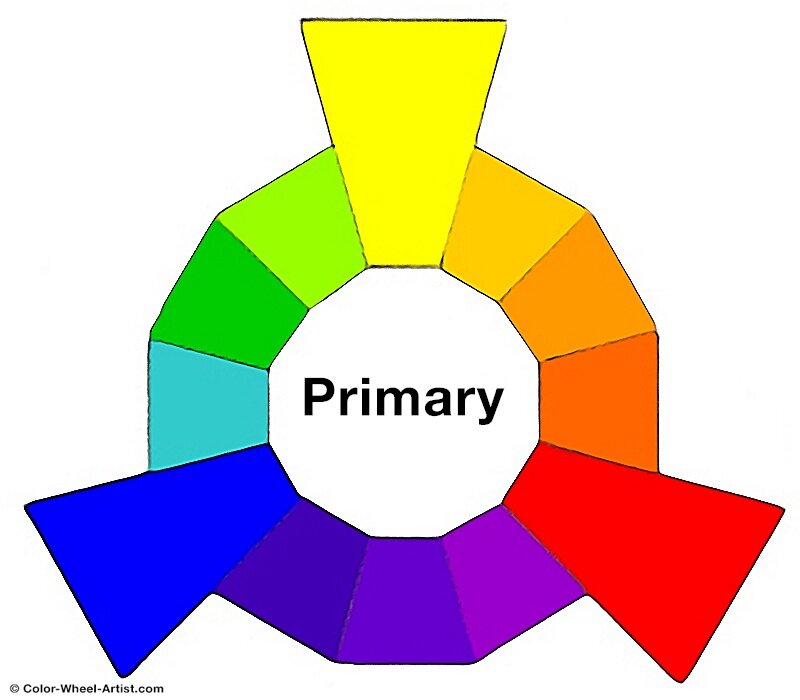
First and foremost, the Primary Colors, Yellow, Red and Blue, are at the top of any color structure. That's because you can think of the three Primaries as the original parents of all the future generations of colors.
In Theory, Primary Colors are the root of every other color.
So in other words, you could conceivably mix gazillions of colors with only three pure Primary pigments of Yellow, Red and Blue. Of course that's what they teach us in school. However, as I wrote in a previous Color Wheel post, color is not an exact science.
The problem is paint pigment never works like that in real life. For instance, if you mix Cadmium Red + Ultramarine Blue, you'll likely be sadly disappointed. If you were expecting a deep rich Violet (Purple), the resulting Brown will be a total surprise.
To understand why, we need to look at paint pigments. A Primary Yellow, Red or Blue paint color usually refers to a paint that contains only one pigment. They are unmixed pigments that can't be created by mixing other colors.
Paint is manufactured with organic, mineral and chemical pigments. As a result, there are many different pure Yellow, Red and Blue pigment paints available.
In our example above, Cadmium Red is a warm pure hue, leaning toward Orange. Blue and Orange are Complementary Colors. Brown is the neutralized result we get from mixing Complementary colors. In this case it's pure Blue + pure Orangey/Red. This result is only great if you actually want a rich Brown.
In this example, if you want to mix a rich Purple instead, use a cool pure Red such as Quinacridone Red. That's because this pure pigment leans away from Orange and mixes harmoniously with the cool pure Blue.
* On the whole, my advice would be to have six Primary Colors in your paint kit.
* These would include Yellow, Red and Blue that lean toward the warm side. And in addition it will be helpful to have another set of Yellow, Red and Blue that lean toward the cool side of the color wheel. Just remember to make sure they are unmixed, pure pigments.

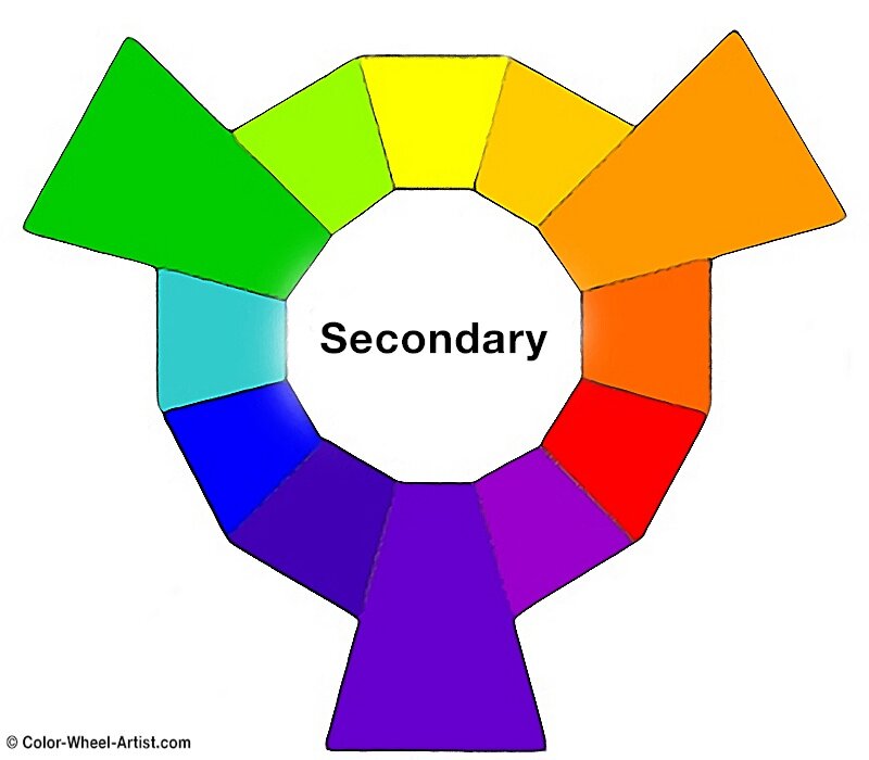
Next come the three Secondary colors, Orange, Purple and Green. Think of the Secondary colors as the children of the three Primaries as shown above.
In color theory we are taught that the Secondary colors are mixed like this:
Again as explained earlier, Color Theory is correct on the surface. It shows us how colors interact in a perfect world. In other words, it serves as a general compass to point us in the right direction.
However, paint color in the real world is another thing entirely. In the same way that theoretical knowledge differs from hands-on experience in a first aid certification course, understanding pigments requires practical application rather than just looking at a chart. This is why so many artists think a Color Wheel is useless. They mix Red and Blue hoping to get Purple. But if you refer back to my example in the previous section where we mixed Cadmium Red with Ultramarine Blue, you'll see the theory doesn't seem to work. In this case, the result is an unexpected Brown. Before long, their Color Wheel gets put aside, never to be looked at again.
We'll be exploring the inner secrets of a color wheel in a later post. In the meantime concentrate on getting a basic understanding the Primary Colors, Secondary and Tertiary colors.
* In general, it's not really necessary to buy Secondary colors. Yes, it's true that you can mix a really broad range of Secondary colors from three warm and three cool Primary colors. But in practice, that's sometimes too much work when you're painting.
* My suggestion is to have at least one pure Orange, one pure Purple and one pure Green on hand. If your budget allows it, you can get three that lean toward cool and three that lean toward warm. Again, let me remind you. Your mixtures will be cleaner and much easier to control if you stick with pure pigment paint color.

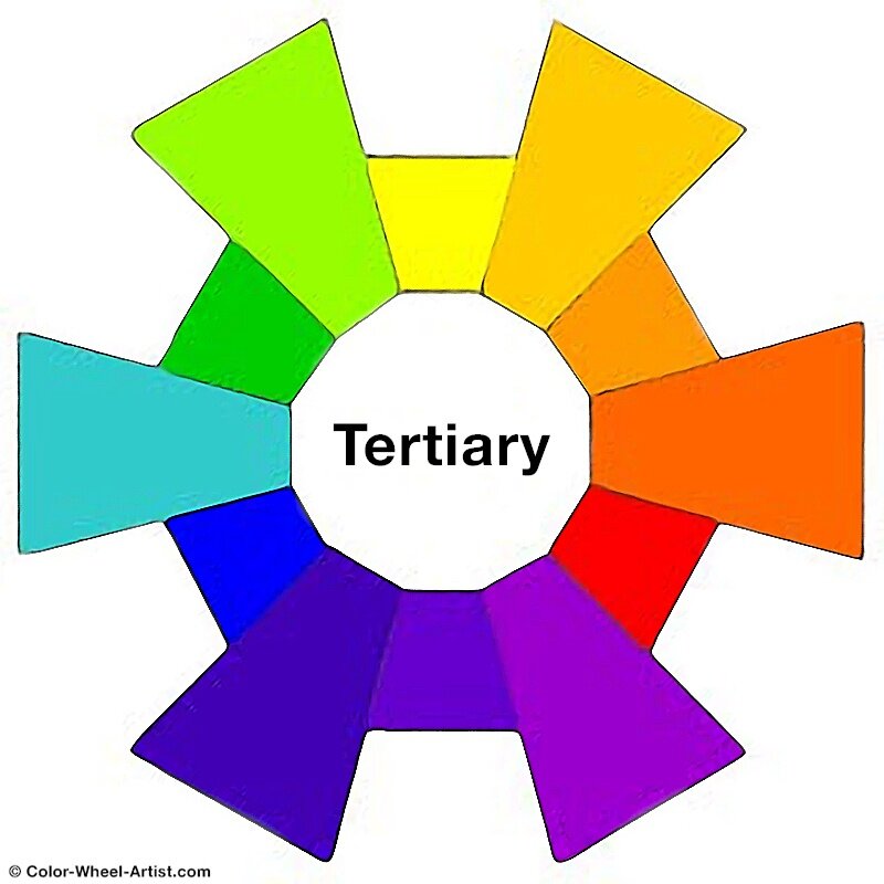
Finally the remaining six colors are referred to as the Tertiary Colors. Think of these as the six grandchildren of the Primary Colors.
Again, Color Theory teaches us that each Tertiary color is the result of one Primary Color mixed with one of its nearest Secondary colors. Therefore we end up with a new color somewhere in between.
As explained earlier, in practical terms, we artists can quickly find ourselves mixing truly ugly colors. If we follow the theory too literally, a lot of paint will get thrown away. It's always best to try out some test samples first.
* Tertiary colors are truly gorgeous because of their complexity. When you go to an art supply store and see the beautiful array of colors, it's so tempting to buy lots.
* Don't let yourself be seduced. Pre-mixed Tertiary paint colors can easily get you into a huge dull mess of clashing colors. Unless you totally understand how pigments will react to each other, it's best to stick with pure Primary colors and pure Secondary colors.
* If you're adventurous, go ahead and buy yourself some Tertiary colors. Just be sure they contain as few pigments as possible. There should be no more than two pigments in the mixture, a Primary Color and a Secondary Color. To be clear, when more pigments are used, the chance of them clashing with your other colors rises about 80%.
BONUS TIP: Always get familiar with how your paint palette mixes before you start painting. Take a little time to do some mixing tests.
Academic writing support provides like essay writer service EssayWritingService personalized essays, tailored to course requirements and written with precision and academic integrity.