SHARE with Friends
- Share
- Tweet
- Share
- Share
- Pin
- You are here:
- Home »
- Blog »
- Color Schemes »
- Complementary Color Schemes – Color Theory and Painting Tips
Complementary Color Schemes – Color Theory and Painting Tips
Complementary Colors are any two Hues positioned exactly opposite each other on the Basic Color Wheel. To be sure, knowing where they lie on a Color Wheel is basic. But even more important, is understanding what this means in a practical sense.
Keep reading to learn how these pairs of colors can help you create more interesting mixtures for your projects.
More...
Tips to Mix Complementary Colors
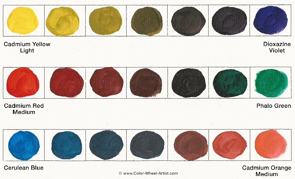
As you can see directly above, the most commonly used pairs of Complementary Colors are:
YELLOW / PURPLE
RED / GREEN
BLUE / ORANGE
Take another look at each mixture, both from left to right and right to left. You can see that when you gradually add a speck of each color's Complement, the resulting mixture becomes less and less intense. Eventually the color is totally neutral.
This is the perfect way to easily knock down the intensity of any color if it's too vibrant. Sometime beginning artists try to reduce the intensity of a vibrant color by adding black. This works too, but it also creates a Shade and the underlying vibrancy of the original color is often lost.
But you must be careful when mixing in a color's Complement. The color changes super quickly so be sure to add extremely small specks at a time.
So why do Complementary Colors react to each other the way they do?
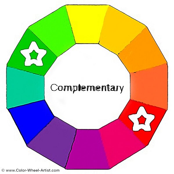
If you look closely at the Color Wheel at the top of this page, you'll notice a few things.
- First, each of the six pairs of Complementary Colors always contain one cool and one warm Hue. This means they are the colors with the most contrast.
- Each pair of Complementary Colors always contain some combination of all three Primary Colors. For example, in the pair Yellow and Purple, Yellow is one Primary and Purple is a mixture of the other two Primary colors Red and Blue.
- When you mix all three Primary Paint Colors together you get a dark neutral. So because Complementary Colors always contain all three Primary colors, they quickly neutralize each other when mixed together.
Painting Complementary Colors From a Photo

Although it's true, when Complementary Colors are blended together, they neutralize each other, they interact differently when placed side by side. As mentioned in the last paragraph, they are the two colors with the highest contrast. As a result they actually intensify each other when sitting next to each other. In Color Theory this phenomenon is called Simultaneous Contrast.
Photographers and artists often take advantage of this fact to create intense drama. Maybe that's one of the reasons we are always so attracted to sunsets. The contrast of Orange and Blue vibrate to capture our attention.
In the same way, if you want to paint the sunset above, you will literally achieve a wonderful result by using only two colors, Blue and Orange plus White and Black to make Gray.
Complementay Colors in Fine Art
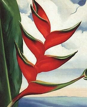
In another example, the painting at left is by Georgia O'Keeffe.
Just observing the main focus of her painting at this time, you can see she has used the Complementary Colors Red and Green to paint her subject.
Notice how she blends the Red into the Green on the leaves to darken them. And she's also added a speck of Green into her Red to reduce the intensity.
Mixing tiny specks of each color into the other creates automatic harmony. Otherwise each color would fight for your attention and jump off the canvas.
Painting Tips for Complementary Colors
* As mentioned earlier, reduce the intensity of any color that's too bright by adding a speck of it's Complementary.
* On the other hand, if you want to make a focus color stand out, place a tiny accent of its Complement next to or near it.
* The most beautiful and interesting Neutrals are created by mixing two Complementary Colors plus White, Gray or Black.
* You can create endless variations of Hues, Tints, Shades and Tones using only two colors plus White, Gray and Black. These mixed combinations will never clash.
Let's Review What You Learned
- Complementary Colors are any two Hues directly opposite each other on the Basic Color Wheel.
- The three main opposing pairs are below.
YELLOW / VIOLET
RED / GREEN
BLUE / ORANGE - You can also apply the same principals to any other of the opposite pairs. They are more complex mixtures. Therefore they will neutralize even more quickly.
- Each pair includes one warm and one cool color. Therefore they are have the most contrast to each other.
- Each pair contains combinations of all three Primary Colors. When you mix three Primary Colors together you get a dark, almost black neutral. Therefore, mixing Complementary Colors neutralizes them also..
- When Complementary Colors are placed next to each other, the visual result is to intensify both. This is referred to as Simultaneous Contrast.
