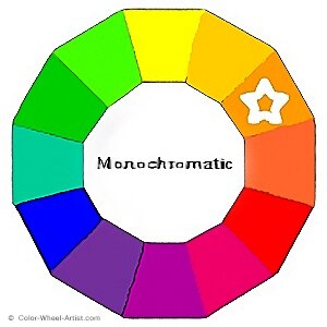
A Monochromatic Color Scheme, in theory, is defined by the use of only one Hue on the Basic Color Wheel.
Practically speaking, it's possible to use various different pigments of the same Hue. For example you could paint with Quinacridone Red plus Alizarin Red, and it would still be considered a Monochromatic Color Scheme. That's because they are both in the Red Hue family.
However, how do you vary this one color to make it interesting, even if you are using different versions of it?
More...
How to Mix Monochromatic Colors for Variety
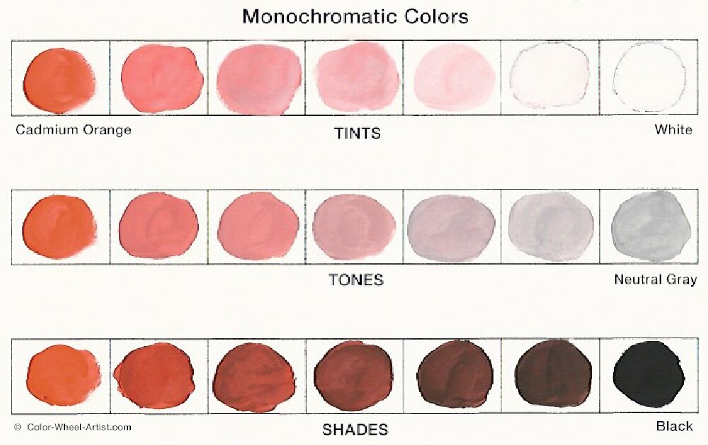
In my pigment test above, you can easily see how one color, in this case Orange, can be varied with Tints, Tones and Shades.
TOP ROW
The Cadmium Orange was ever so gradually added to the White. The result are very softened pastels from nearly White to barely Tinted Orange. In other words, the White has the effect of altering both the Values,(light to dark) and the Saturation (bright to dull) of the Orange.
MIDDLE ROW
This time, the Orange was mixed in to a Neutral Gray which I made with White plus Black. Again, the resulting range of Mid-Tone colors are softened yet subdued.
It should be pointed out here, the original Hue color that you mix with Neutral Gray will not change in Value much. It will be very close in lightness or darkness to the Value of the Neutral Gray you mix it with. So that means if you use a Dark Gray, your Tones will also be dark. Conversely, if you use a Light Gray, your Tones will be light.
On the other hand the Saturation is increasingly reduced as you add more Gray. This will be the same no matter how light or dark your Gray is. Therefore your mixture still contains the same underlying Hue, but is now a less intense Tone.
BOTTOM ROW
Tiny amounts of Black were added to create Shades. The mixtures are clear, dark and bold with an underlying warmth of Orange. Obviously, adding black has the effect of both darkening the Value and making the Hue less Saturated.
Finally, even if you only have one tube of paint, plus Black and White in your paint box, you can create beautiful paintings that are calming and quiet. It's amazing how far this limited range of Values and color Saturations can take you. Let me show you some examples.
Monochromatic Textile Example
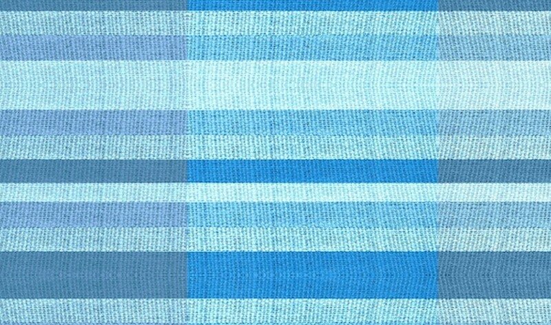
The fragment of textile above gives a pretty clear picture of how one color can be varied in many ways. With Monochromatic Colors, subtle differences is the key.
In this example, the same blue is woven throughout, but it has different Values and Intensities in each band of color, both horizontally and vertically.
Notice how the vertical center column is primarily made up of Tints. They range from very pale pastel to only slightly tinted bright blue.
Now compare the two columns on the right and left sides. Although it's subtle here, look closely. Do you see how the right column contains Tones of the blue and the left column are Shades? Notice how the Toned right column appears only slightly less intense than the center Tinted column. By comparison, the Shade column on the left side is much darker.
Example of a Monochromatic Painting

Now let's take a look at the painting above by American Master, Richard Diebenkorn from his 'Ocean Park Series'.
This is a gorgeous example of a Monochromatic Color Scheme. Diebenkorn has used one Blue/Green paint color, similar to the textile sample. Instead of strict divisions of color changes, he has expertly blended his Blue/Green in a very broad and sensuous range of Tints, Tones and Shades. The resulting effect is quiet and serene.
But, there's a reason, he is considered a master painter. If you notice, he's added very discreet touches of Red/Orange, which is the Complementary color of Blue/Green. This has the effect of enlivening the surface and moving the eye around.
He has also added a few lines of the Analogous color Green. Even though these other colors are barely noticeable at first glance, they subconsciously keep the solitary color from being boring.
In spite of the fact he has sneaked in a few other colors, this is still considered a Monochromatic painting. Instead of being a slave to the 'rules', Diebenkorn has bent them to fit his own unique personal expression. This is the sign of a true artist.
Painting Tips for Monochromatic Colors
* The most fool-proof method to achieve a sophisticated range of Tints, Tones and Shades is to use only one Hue.
* To mix the cleanest, most beautiful range of colors, begin with a pure pigment, not previously mixed with any other color.
* Mixing Tints, Tones and Shades are most predictable if you use only White and Black, and mix Gray from them. Experienced painters will often use other Light, Grey and Dark pigments instead. Just be careful, because they may alter your original Hue in unwanted ways.
* Experienced painters will often use other Light, Gray and Dark pigments instead of White and Black. Just be careful, because they may alter your original Hue in unwanted ways. It's always wise to pre-test before painting.
Let's Review What You Learned
- You create a Monochromatic Color Scheme by using one Hue repeated in a variety of Tints, Shades and Tones.
- You increase the variety to keep things from getting boring by varying the Values and Saturations.
- This Color Scheme is usually calm, serene and subtle.
