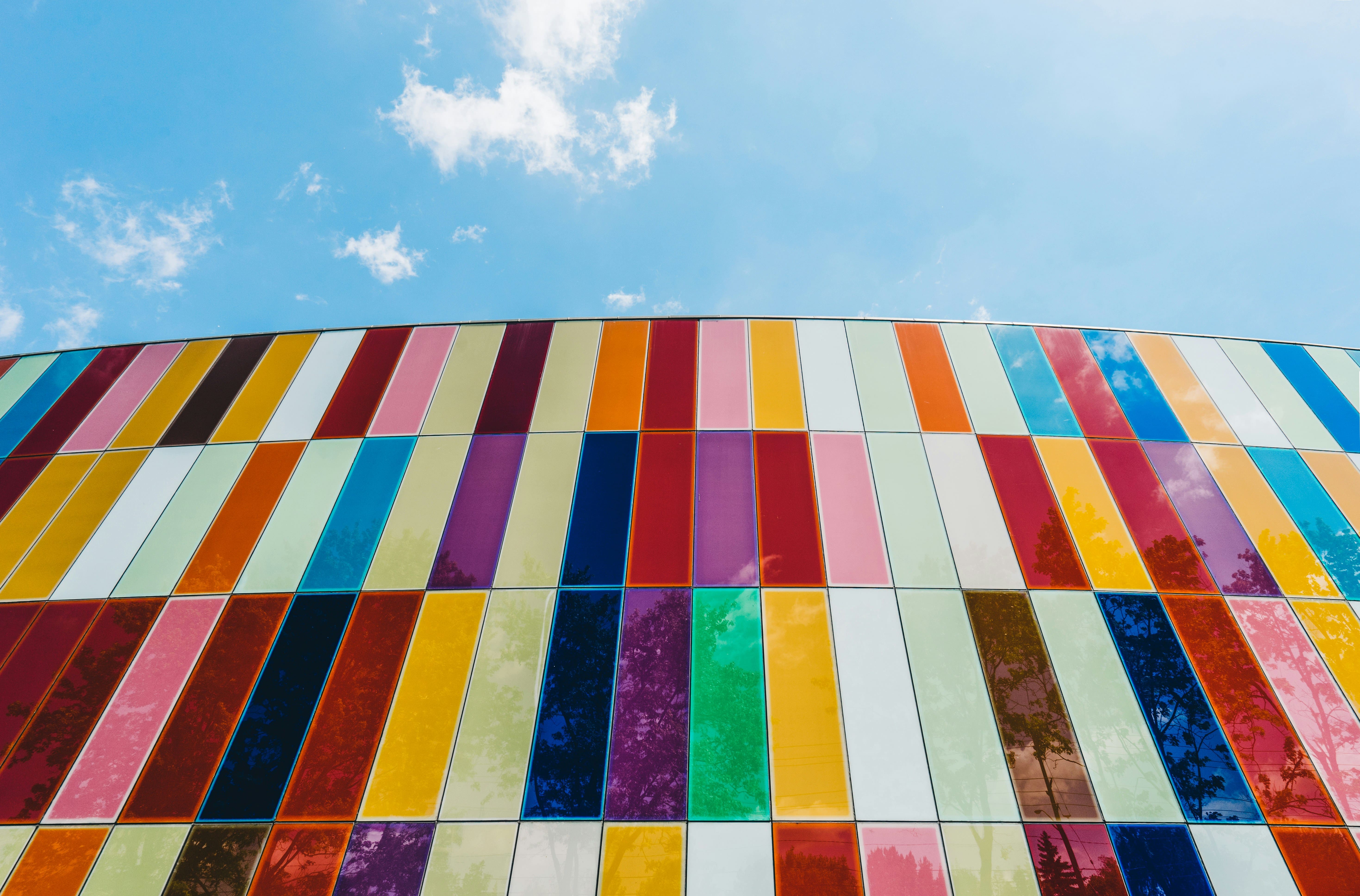
Color isn't just about what looks pretty on a canvas. It's a tool, like perspective or composition, that artists use to communicate meaning. Get it right, and your work feels alive. Get it wrong, and something feels off, even if you can't explain why.
You've probably mixed red and blue to make purple in elementary school. But in art, color goes much deeper. Once you understand the full scope of what's happening on the color wheel, you'll start to see how professional artists create mood, contrast, and focus with intention. What is color in art? If you've ever asked yourself that, you're about to get a straight answer.
Color Definition in Art
In visual art, color is how we see reflected light. That's the science part. But in practice, color is how artists shape space, build emotion, and move the viewer's eye. A single shift in tone can take a piece from dull to dramatic.
Artists don't just use color because it's their favorite. They pick based on meaning, context, and how colors interact with each other. Whether you're working digitally or in oils, understanding how color behaves is essential.
Hue, Value, Saturation: The Core Color Terms
Before you dive into mixing palettes, you need to understand the three terms that form the foundation of all color decisions.
Hue
Hue is the name of a color: red, green, blue, yellow. It is important because it influences how we feel. Red gets your heart rate up. Blue calms it down. Artists use hue to suggest heat, light, or emotional intensity without saying a word.
Value
Value is how light or dark a color is. This matters more than most beginners realize. A high-value (lighter) red and a low-value (darker) red might be the same hue, but they'll behave totally differently in a painting. Value is crucial for showing depth, volume, and focus. In black-and-white art, you're really just working with value. Master that, and adding color becomes way easier.
Saturation
Saturation describes a color's purity or level of dullness. High saturation = vivid, bold, punchy. Low saturation = soft, dusty, neutral. Think of a bright red apple versus a faded maroon sweatshirt. Both are "red," but one is way more intense. What is tone color in art? Tone, or tonal variation, is often used to describe subtle shifts in saturation and value.
Other Important Color Concepts in Art
There are other tools that help you control how color behaves in your work.
Temperature
Warm colors (like red, orange, and yellow) feel closer and more energetic. Cool colors (blue, green, and purple) feel distant and calm. Artists use temperature to build atmosphere or suggest lighting. In a painting of a sunset, you'll probably shift everything toward the warm end of the spectrum, even the shadows.
Complementary and Analogous Colors
These terms come straight from the color wheel. Complementary colors sit opposite each other, like blue and orange, and create high contrast when paired. Analogous colors sit side by side and create harmony. Use complementary colors when you want a pop. Use analogous colors when you want softness. The balance of these choices answers the bigger question: What is color theory in art? It's about the strategy behind color decisions, not just preference.
Color Symbolism
Different colors mean different things depending on the context. Red can signal love or danger. White might mean peace in one culture and mourning in another. If your piece is about identity, politics, or culture, your color choices are part of the message.
How Artists Use Color in Art to Create Mood and Impact
Artists use color to build emotion, even when the subject is totally still. A muted palette can suggest melancholy. High contrast can create drama or tension. If your goal is to make viewers feel something, such as joy, discomfort, nostalgia, color is your first tool. If you're stuck on what colors to use, exploring different color wheel ideas can help you build a more balanced and eye-catching palette.
The mood of your work can change with just one tweak in saturation or temperature. Students often overuse bright colors thinking it adds energy, but too much saturation flattens the image. Think about the emotional goal first, then choose colors that match it. Subtle changes do more than loud ones.
Why Understanding Color Terms Matters for Artists
Without the vocabulary, you're just guessing. And guesswork leads to muddy palettes, confusing focal points, or flat-looking paintings. Understanding these terms helps you edit, critique, and build with purpose.
Whether you're sketching for fun or studying for a degree, knowing how color behaves makes your work stronger and your choices more confident.
Conclusion
Color is more than just "what looks good." It's a set of choices that shape how people respond to your work. Once you understand hue, value, saturation, and how color temperature and relationships work, you're no longer relying on luck.
