Color Wheel Artist


Educational Insights into the Turquoise Colour: Definition, Codes, and Combinations


Turquoise color has long captivated both artists and educators with its unique blend of blue and green hues. Its versatile appeal makes it a frequent subject in art and design classes and an effective tool in educational environments. Additionally, turquoise plays a significant role in color wheel art, where its balanced tone helps illustrate the seamless transition between cool and warm hues. In this article, we will explore the multifaceted nature of turquoise color by discussing what color is turquoise, diving into the types of turquoise color, examining the turquoise color code, and exploring creative turquoise color combination ideas. This discussion not only delves into the artistic side of turquoise but also highlights its applications in educational settings.

What is Turquoise Colour?

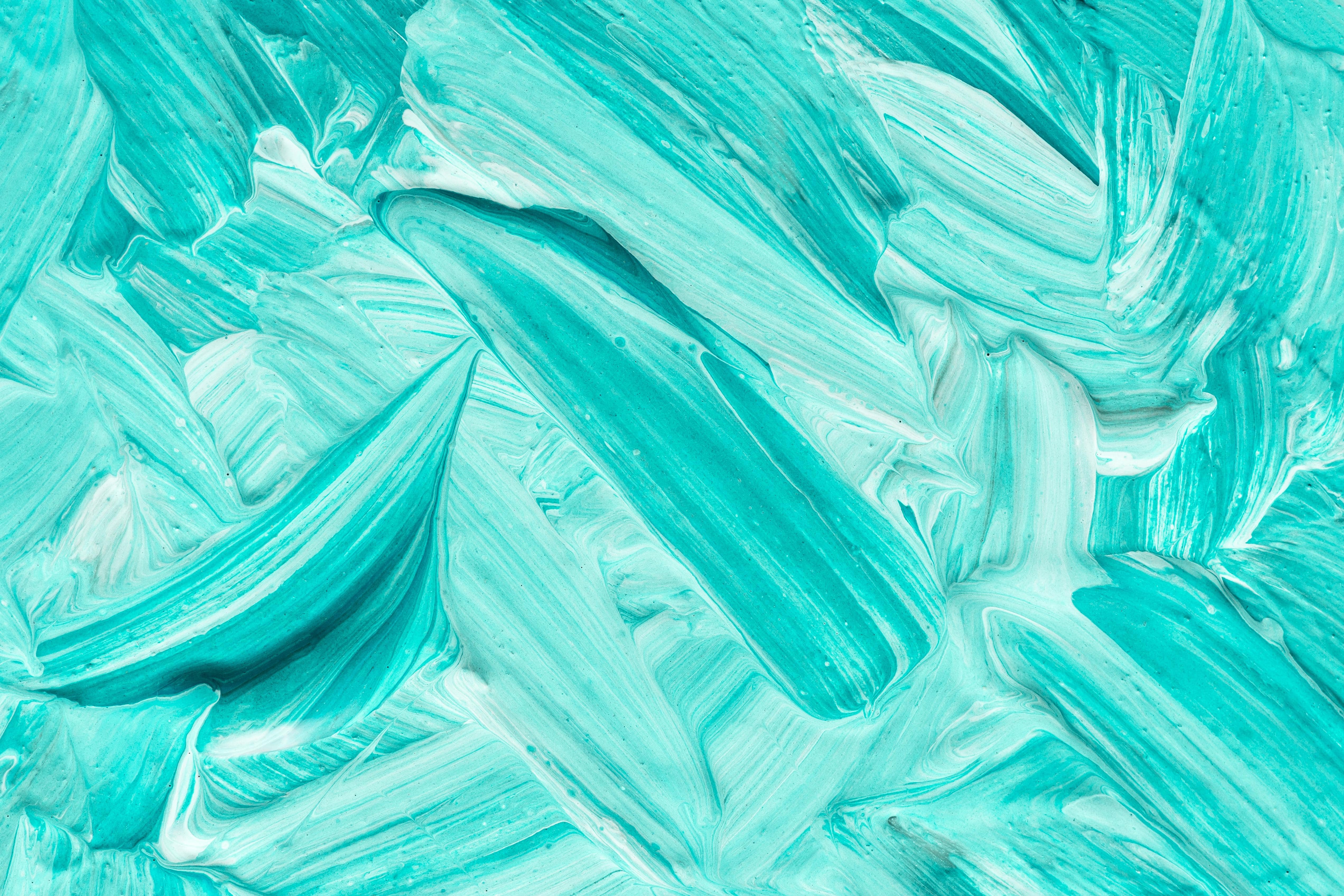
When exploring the question, what colour is turquoise, it is essential to note that turquoise is more than just a shade. It is a color that embodies the tranquility of blue and the rejuvenating energy of green. Often associated with clarity, calmness, and creativity, turquoise color has been used in educational materials to stimulate focus and inspire creative thinking among students. Many educators integrate this color into classroom design, utilizing its calming properties to enhance learning environments.

For those interested in the psychological aspects of color, Verywell Mind offers a detailed discussion on color psychology. This resource explains how colors, including turquoise, can influence mood and cognitive performance, particularly relevant in educational contexts.

Types of Turquoise Colour

The term "types of turquoise colour" encompasses a range of hues, from soft, pastel variants to more vibrant and saturated tones. Each variant of turquoise can evoke different feelings and is suited to various applications in art and education. For example, lighter shades of turquoise are often employed in environments where a calm, serene atmosphere is desired. These hues are perfect for classrooms where focus and tranquility are key to effective learning.

Conversely, deeper and more saturated forms of turquoise might be used in creative projects or as accent colors in educational materials to draw attention and stimulate creative thought. Understanding these variations is crucial for educators who wish to incorporate color theory into their curriculum. For an in-depth look at the different shades of turquoise and their applications, consider visiting Color Matters, which offers an expansive overview of turquoise in design.

Understanding the Turquoise Colour Code

In today's digital world, the turquoise colour code is an essential tool for maintaining consistency in design projects, whether in digital media or print. The standard hexadecimal code for turquoise is commonly represented as #40E0D0. This specific code ensures that the shade remains consistent across various platforms and media whenever turquoise is used in educational materials, whether in digital art projects or classroom presentations.

Understanding this technical aspect is particularly important for students studying digital media, graphic design, and web development. It equips them with the knowledge to reproduce the exact hue of turquoise in their projects. The uniformity provided by using the correct turquoise colour code is critical in creating professional and cohesive educational content. To learn more about hexadecimal codes and their applications in web design, the W3C offers a thorough guide on digital color usage.

Turquoise Colour Combination in Educational Design

Creating harmonious designs is a key skill in both art and education. Turquoise colour combination refers to strategically pairing turquoise with other colors to achieve balance and aesthetic appeal. Combined with complementary hues such as coral, navy blue, or warm grays, turquoise can enhance visual interest and clarity in educational materials.

For instance, a classroom decorated with turquoise accents combined with coral or soft neutrals can create an environment that is both vibrant and conducive to learning. These color combinations are pleasing to the eye and are practical tools for educators looking to design stimulating yet organized learning spaces. Incorporating these color strategies can help explain concepts such as contrast and harmony in art classes and foster a better understanding of design principles in subjects like marketing and visual arts. Detailed information on effective color combinations can be found at Sessions College for Professional Design.

Educational Applications of Turquoise Colour

Turquoise color's role in education extends well beyond its visual appeal. Its inherent qualities of calmness and clarity make it a powerful educational aid. Educators have observed that turquoise environments can reduce stress and improve student concentration. This phenomenon is supported by research in environmental psychology, which has shown that certain colors can have a tangible impact on mood and cognitive performance.

Moreover, turquoise colour has historical and cultural significance that can enrich educational curricula. Various cultures, including many Native American communities, have revered turquoise for its healing and protective properties. Integrating lessons on the cultural history of turquoise into subjects like art history, anthropology, and world cultures not only broadens students' understanding of the color but also promotes multicultural appreciation. This interdisciplinary approach allows students to explore the relationship between art, history, and society, providing a more comprehensive educational experience.

Integrating Turquoise Colour into Curriculum

One innovative approach to teaching involves the hands-on exploration of colors and their impacts. Educators can create projects that encourage students to experiment with different types of turquoise colour and understand the technical aspects by using the correct turquoise colour code in their digital artwork. Such projects help students grasp the fundamentals of color theory and enhance their digital literacy and design skills.

For example, a practical classroom activity might involve creating digital posters or mood boards showcasing effective turquoise colour combination strategies. These projects require them to think critically about how colors interact and the emotions they evoke, providing a platform for both creative expression and technical learning. By integrating these lessons into the curriculum, teachers can foster a more engaging and interactive learning environment that bridges the gap between theoretical knowledge and practical application.

Conclusion

In conclusion, turquoise colour is much more than just an attractive hue—it is a dynamic educational tool that can enhance learning environments and stimulate creative thinking. Whether exploring what colour is turquoise, experimenting with various types of turquoise colour, or mastering the technical aspects of the turquoise colour code, this vibrant shade offers endless possibilities for artistic expression and educational enrichment.

By understanding and applying effective turquoise colour combination techniques, educators and students alike can create inspiring visual projects that communicate complex ideas with clarity and beauty. As a prominent hue in art, turquoise not only serves as an eye-catching element but also harmonizes with other colors to elevate creative compositions. Embracing the educational potential of turquoise colour enhances artistic endeavors and supports a deeper understanding of cultural and historical contexts. As you integrate turquoise into your educational projects, remember that its balanced blend of blue and green promotes aesthetic appeal and fosters an environment of calm and creativity—key ingredients for successful learning.

Turquoise color continues to shine as an emblem of both artistic brilliance and educational innovation. Whether in the classroom or on a digital canvas, its unique qualities make it a versatile and inspiring choice for educators and students striving for excellence in design and creative expression.

Popular posts


The Ultimate Guide to Understanding Hue, Tint, Tone and Shade
Color Theory
Feb 19, 2017

Primary Colors, Secondary and Tertiary Explained
Color Theory
Feb 15, 2017

Triad Color Schemes – Color Theory and Painting Tips
Color Schemes
Mar 14, 2017

Complementary Color Schemes – Color Theory and Painting Tips
Color Schemes
Mar 10, 2017