When you look at Monet’s paintings, you realise that the colours don’t rush. Blue doesn’t immediately act like blue.
Green sometimes hides behind the mist. Purple tries to be a shadow, but it also looks a bit like light. I think that’s why Monet’s colours make such a good starting point for presentation design. Because a good presentation shouldn’t shout either.
It should guide the eye, but do so without tiring the viewer.
In many presentations, the colour scheme is sorted out at the last minute. First the text is written, then the graphics are added, and finally a ready-made theme is chosen from somewhere.
The result is sometimes rather odd. The title seems to be from one world, the icons from another, and the colours of the graphics look as though they’ve turned up at the meeting by mistake.
Creating a palette inspired by Monet can bring this chaos under control. Because colours in this style don’t clash. They behave like people who can converse in the same room. If you want to find colour combinations that feel soft, balanced, and visually connected, you can use ColorWeelArtist as a starting point before applying the palette to your slides.
Understanding Monet’s Palette: Pale Blues, Sage Greens and Lavender Shades
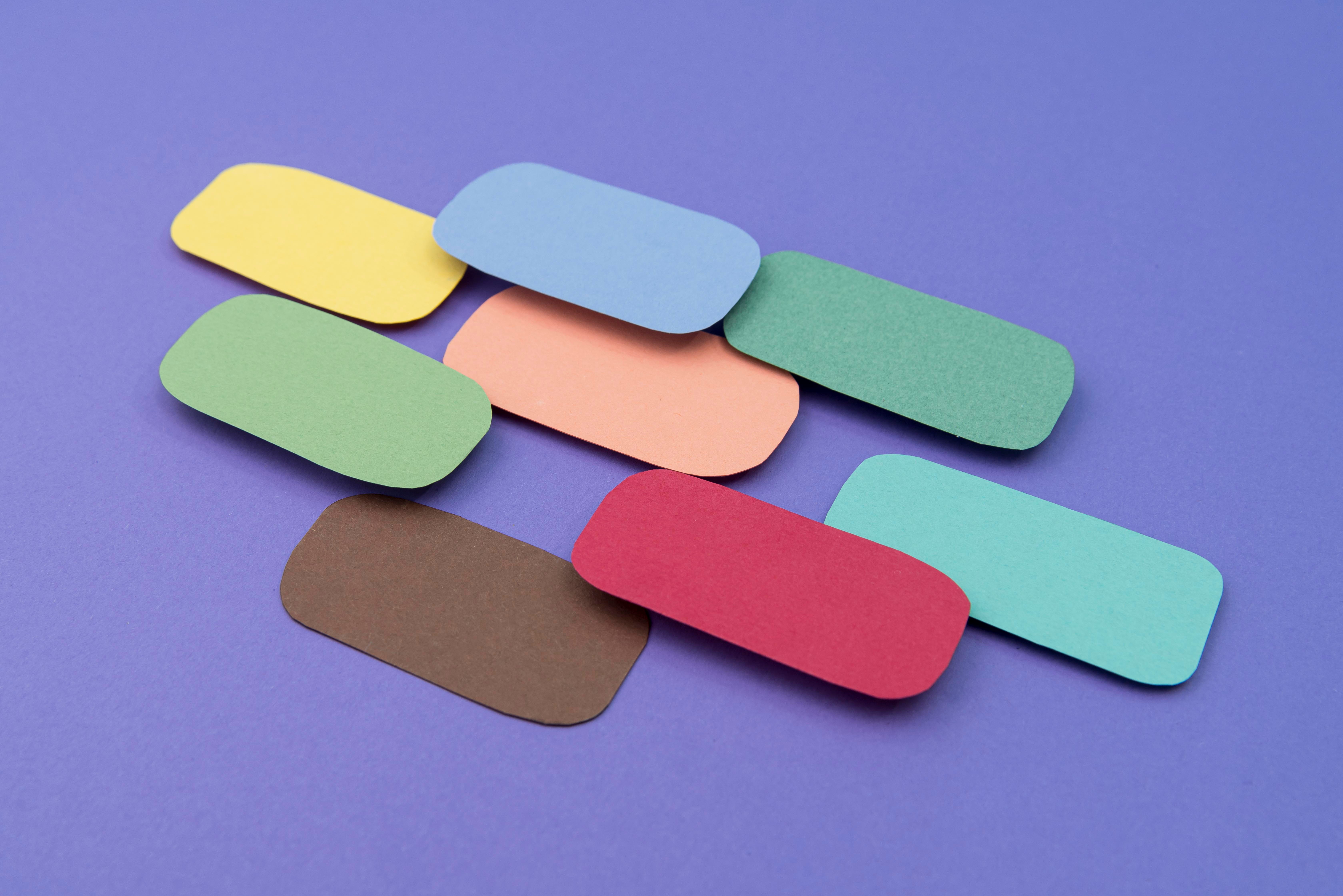
To bring Monet’s world of colour to a slide, there is no need to copy the painting exactly. In fact, this often leads to the wrong result. The aim in presentation design is not to recreate the water lily pond, but to understand the logic of light in that pond. Monet uses colours not directly, but often in a broken manner. A touch of grey is mixed into the light blue.
The green isn’t overly bright. The lavender tone sits like a shadow but doesn’t add a coldness to the slide. When building a presentation palette using this logic, it’s a good idea to choose the first colour for the background.
Instead of pure white, you could use a very light blue-grey or a misty cream tone. This makes the slide appear softer. In particular, a white background can sometimes have a fluorescent effect on the eyes during long presentations.
A light blue-grey, on the other hand, provides a calmer backdrop.
The second colour group could consist of muted greens. Mint, olive, and light greens with grey undertones convey a sense of trust and naturalness in a presentation.
These work well in boxes, graphic elements, or section dividers. The third group consists of lavender and pale purple tones. Think of these colours as shadows. They don’t need to be the main focus. But when used in the right place, they add depth to the slide.
A warm accent colour is also important. Monet’s palettes aren’t just cold colours. Sometimes small touches of yellow, cream or peach, like sunlight, bring a painting to life.
In a presentation, you can use these tones on buttons, key figures or small icons. But use them sparingly. If you use too much, that elegant feel can suddenly turn into a summer wedding invitation.
Establishing a Colour Hierarchy in Slide Design
Choosing beautiful colours is one thing; assigning those colours the right roles is quite another. A palette may contain five colours, but if the purpose of each colour isn’t clear, the slide will still look chaotic.
When preparing a presentation, I find it more effective to first categorise colours according to their roles. The background colour, main text colour, heading colour, accent colour and supporting colour should all be considered separately.
For the main text, one should avoid very light or overly vibrant shades. Even in a Monet-style design, readability should never be compromised. Dark blue-grey or charcoal work well against a light background.
Black can sometimes appear too harsh. Dark grey, on the other hand, conveys a calmer sense of seriousness.
A slightly stronger shade of blue can be used for headings. It is best to avoid the overly corporate look of navy blue and opt for a more muted, greyish blue instead. Warm cream, pale gold or a light peach tone can be used as the accent colour.
These colours are particularly effective in data slides. If you want to highlight a single number in a graph, you don’t have to resort to red. A warm Monet-style accent can achieve the same effect in a more elegant way.
Another advantage of a colour hierarchy is speed. Once the system is set up, you don’t have to make decisions all over again for every slide. The title is this colour, the call-out box is this shade, and the bullet points are this colour.
This helps the presentation look more professional. Ready-made templates can also be useful here.
In particular, those who don’t want to start from scratch can take a structured layout from resources such as free PowerPoint templates and adapt it to their own visual style using Monet-inspired colours.
The impact of colour should not be underestimated when it comes to statistics either.
Numerous studies on colour psychology have shown that people process visual information faster than text.
In presentations, this means that the audience often reads the colour first, the heading second, and the detailed text last. In other words, colour is not merely decorative; it acts as a silent signpost that determines the order in which the slide is read.
Applying to Modern Presentations: Looking Artistic While Remaining Professional
Taking inspiration from Monet doesn’t mean you have to make your presentation overly romantic.
Whether it’s finance, marketing, education, product launches or an agency presentation, this colour palette can look perfectly professional if used correctly. The secret here is to use the colours in controlled areas rather than in large swathes.
A light blue-grey background, a large dark blue heading and a small warm yellow line on the cover slide could be a good starting point.
White or cream cards can be used for content slides. If a very subtle lavender shadow is applied to the back of these cards, the slide won’t look flat. When it comes to graphics, it’s best not to use more than three primary colours. The Monet effect comes from transitions, not clutter.
The same principle applies to slides featuring photographs. Highly saturated, high-contrast images clash with the Monet palette.
It is necessary to select images with softer lighting and natural tones. If an image is too harsh, a semi-transparent light blue or cream layer can be added over it. This small adjustment makes the entire slide appear as though it belongs to the same family.
Personally, I believe that this style of colour palette works best in presentations that tell a story. When explaining the development of a product, the spirit of a brand, or why an idea is valuable, colours do not simply remain in the background.
They set the audience’s mood. A story told with stark blue and neon green evokes a different feeling. A story told with pale blue, lavender shades and warm cream evokes another.
And here’s another thing: not every slide needs to be striking. Some slides should simply give the audience a breather.
A Monet-style palette works very well here. Because it doesn’t constantly bombard the audience with visual stimuli. It establishes a calm rhythm.
By the end of the presentation, people might not remember the individual colours. But they’ll sense that the presentation was clean, balanced and well-thought-out. Sometimes, that’s precisely the best result in design.
